How to Grasp and Hold your Audience’s Attention

Are you still using the same boring presentation set up?
Are you finding your attendees fidgeting, heading for the coffee station or just plain staring off into the distance with that glazed look blanketing their eyes?
Not to worry, while content is king, you can grasp your audience’s attention quickly and hold it longer simply by changing your stage set-up.
Sound too easy?
Consider this: A study by the University of Pittsburgh on Audience Adaptation discussed the affects a setting has on an audience, “The setting of a presentation can influence the ability to give a speech and the audience’s ability and desire to listen…Visual presentations and set elements can greatly impact an audience.” While an audience can easily be distracted when the material is boring or the presenter appears uncomfortable delivering the message, you can help both the audience and speaker by creating a visually stimulating background.
Stage elements that demand attention!
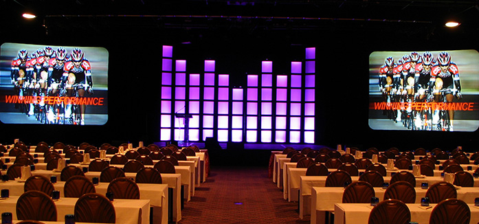
If your presenter has a PowerPoint filled with numbers, charts and facts or awkwardly stands at a podium reciting words, the audience will usually begin searching the room for something to break the monotony. While you cannot control a presenters speaking style, you can do your part to avoid the darting eye syndrome by changing your stage backdrop. Instead of relying on the usual two screens in dress kits flanking the stage or even a wall of drape with two side screens, try adding some depth to the stage with set elements. These can be as simple as column structures in varying heights uplit and set against a draped wall. Staggering pieces of different sizes or shapes adds dimension and forces the eye to find a focal point which will typically be the one element positioned in front of the images – the presenter.
You may also want to consider renting a backdrop from a prop house. Backdrops can be a bit more expensive than some stage props but they instantly add depth and character to your stage. A word of caution though, be careful not too go overboard and get too fancy with your backdrop. If your meeting is about clinical research choose a backdrop that shows the image of library or the interior of a science lab (yes they exist). Have a conference on infrastructure? Choose a backdrop with city bridges. Discussing funding for a new city project? Try using a city skyline as your backdrop. There are several backdrop companies throughout the nation; many as you may have guessed are located in Hollywood, but ship nationwide.
If props and backdrops aren’t your thing, then create a video composite of various images about your company or organization. This will take a bit more work, lead-time and money but it’s a great way to set the stage for a keynote. Once a presenter is on stage, however, the video should fade out or be set to one static image to avoid any distraction.
If you take a little time to think outside the box (in fact throw the box away), you’ll find that there are plenty of options to add stage depth and provide a refreshing background that is certain to capture and hold your audience’s attention!


